


浅葉克己が追い求めた文字の力。
Feature | 2025.10.24
トンパ文字との出会いが拓いたタイポグラフィの新たな可能性。
《アートディレクター》
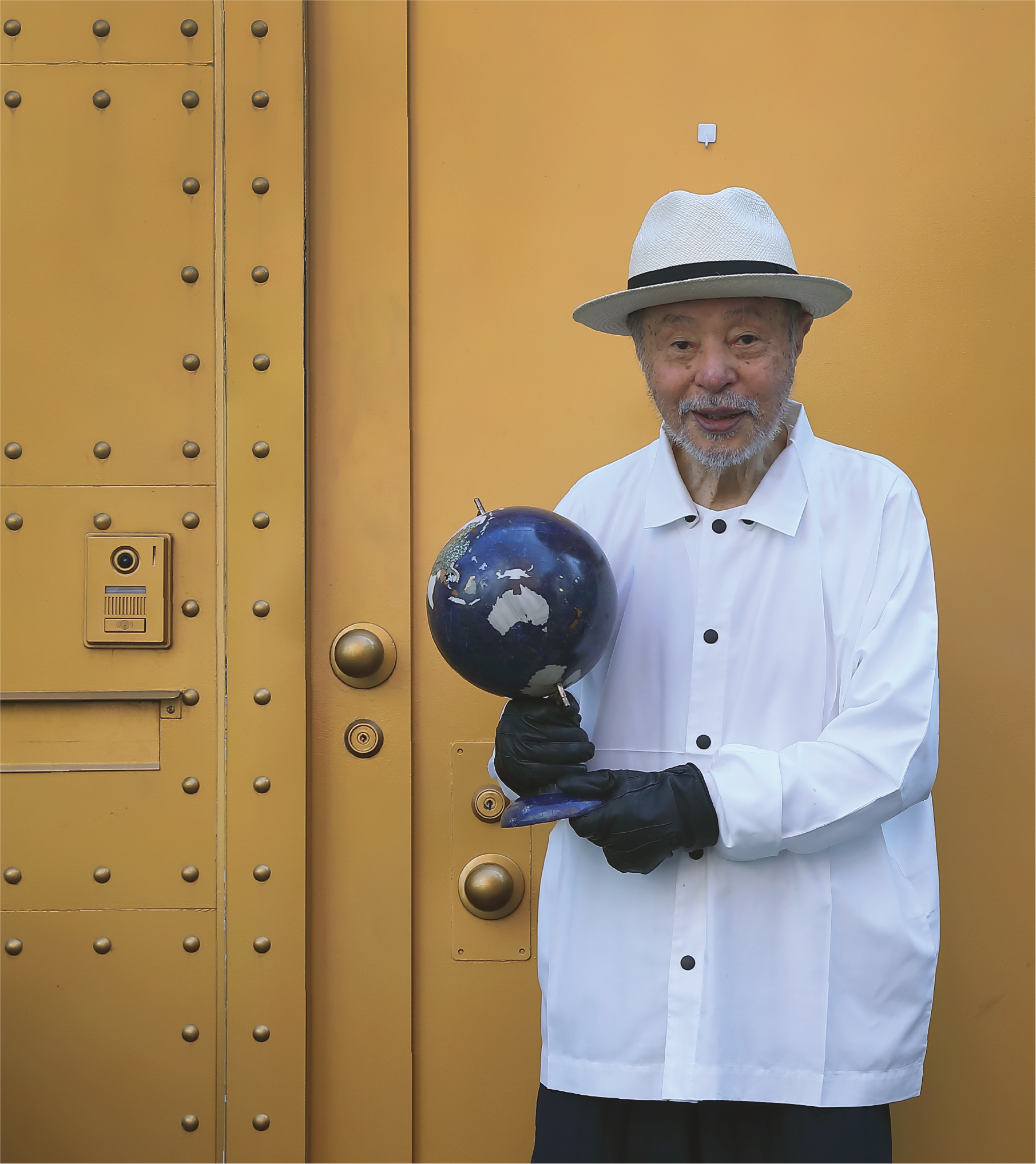
浅葉克己 Katsumi Asaba
1940年神奈川県生まれ。
桑沢デザイン研究所、ライトパブリシティを経て、75年浅葉克己デザイン室を設立。
代表作に、サントリー「夢街道」、
西武百貨店「おいしい生活」、武田薬品「アリナミンA」、三宅一生のロゴマーク関連など。
日本アカデミー賞、東京ADC最高賞、紫綬褒章、旭日小綬章、亀倉雄策賞など受賞多数。
東京ADC委員、東京TDC理事長、JAGDA理事、
桑沢デザイン研究所10代目所長、東京造形大学客員教授。
京都精華大学客員教授。青森大学客員教授。卓球六段。
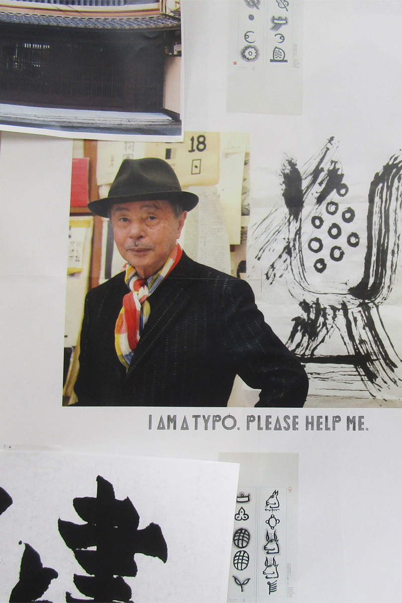
1970年代〜1980年代、それは日本のグラフィックデザイン隆盛の時代。亀倉雄策や田中一光、永井一正といったグラフィックデザイナーの巨匠たちが築いた土台を受け継ぎ、さらなる可能性を探り、グラフィックデザインをアートの領域にまで広げたクリエイターが活躍していた頃。そんななかでも飛びきり鋭い感性でデザイン界をリードしていたアートディレクターが浅葉克己さん。
浅葉さんは広告などのアートディレクションで活躍する一方、“地球文字探検家” として世界中の文字を探し歩き、観察し、収集してきた。「文字は深い。その探究は一生かけても終わらない」と語っていた浅葉さんにとって、文字は単なる記号ではなく、人間の文化や感性そのものを映しだす存在だったのかもしれない。
浅葉さんのタイポグラフィへの関心は国境を越えて広がっていく。西欧にとどまらずアジア、アフリカ、さらには少数民族の文字にまで目を向けた。文字はどこで生まれ、どのように人々の生活のなかで生きてきたのか。そんな探究心が浅葉さんの好奇心を刺激し、行動に駆り立てていた。
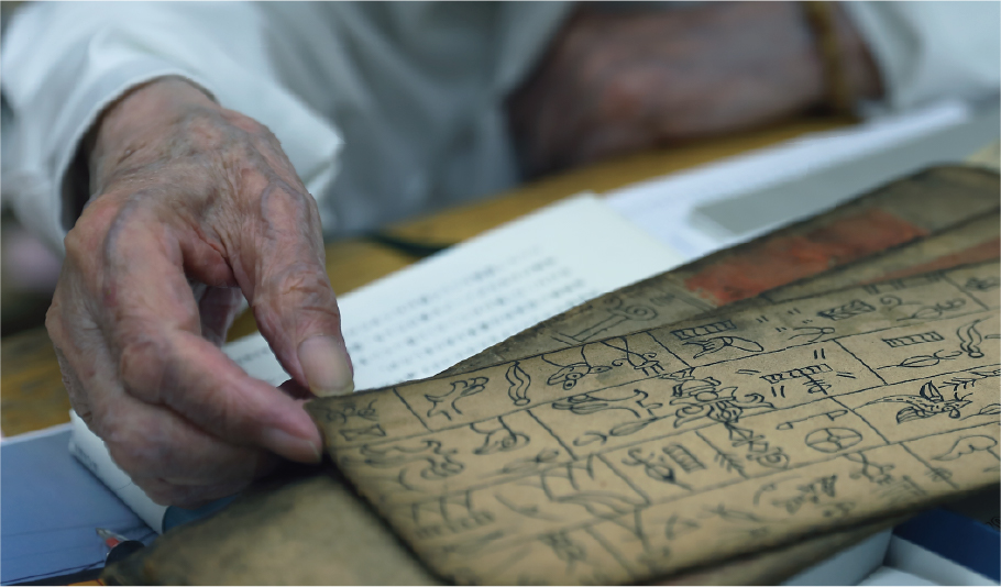
そうした旅の途上で、浅葉さんは中国・雲南省の麗江に伝わる「トンパ文字」と出会う。トンパ文字とはナシ族が用いてきた象形文字で、アルファベットや漢字のように抽象化の進んだ文字とは異なり、描かれた姿がそのまま意味に直結する。
山の形は山を表し、人の姿は人を示すといった、現存する数少ない象形文字体系とされる。絵に近い形を持ちながら、祈りや物語を記録する機能を果たすトンパ文字に、浅葉さんは強烈なインパクトを受けた。
デザインの現場では、文字は読みやすさやコミュニケーションの効率といった面から善し悪しが決められる。しかしトンパ文字は、必ずしも効率的ではない。むしろ、祈りや物語を伝えるために、象徴的であり、詩的であり、そして不完全さをも含み込む。その姿に浅葉さんは、文字が人間の営みのひとつであることを改めて実感したのだろう。
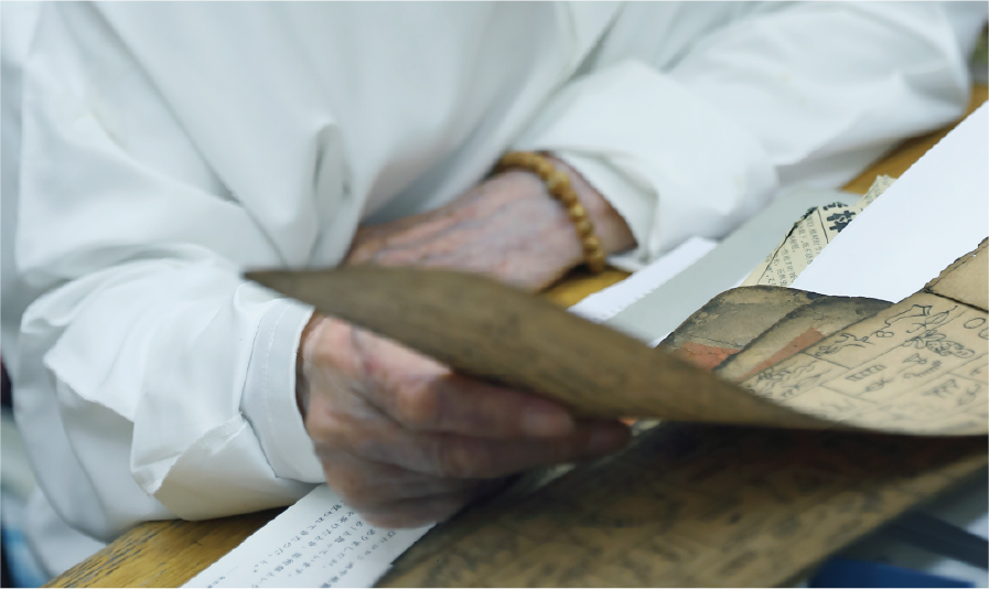
浅葉さんは現地で、ナシ族の教典を見てトンパ文字の生きてきた時間の流れを知りたいと思った。しかし教典は、日本には一冊も存在しないことを知る。そこで、現地で街の骨董屋に行き、有り金をはたいて手に入れたという。
この出来事は、浅葉さんが文字を “資料” ではなく “生きた存在” として感じたことを物語っている。現地で教典を手にし、ナシ語を聞き、祭司が語る儀式に触れ、文字が使われてきた生活の場を見たことで、抽象だけではない文字の力を改めて思い知った。そして、自身の作品や表現の中にも、こういった “文字” のあり方を取り込もうと決意する。
The power of letters as pursued by Katsumi Asaba.
How an encounter with the Dongba script opened up
new horizons in typography.
Katsumi Asaba was a leading art director during the golden age of Japanese graphic design (1970s–1980s), known for his exceptionally keen sensibility. Alongside his advertising career, he embraced the role of “planet-roaming character adventurer,” traveling the world to observe and collect scripts. For Asaba, who felt that the exploration of characters was an endless journey, type was not a mere symbol but a reflection of human culture and sensibility itself. His fascination drove him to look beyond Western traditions, exploring the scripts of Asia, Africa, and various ethnic minorities, seeking to understand how they originated and lived within people’s lives.
This quest led to a pivotal encounter with the Dongba script in Lijiang, China. Used by the Naxi people, Dongba is a rare surviving pictographic system where the drawn form directly represents its meaning—a mountain’s shape indicates ‘mountain.’ Unlike abstract alphabets or kanji, this script functions to record prayers and stories, leaving a powerful impact on Asaba.
He contrasted Dongba’s symbolic, poetic, and even “imperfect” nature with the modern design world, which judges characters based on readability and communication efficiency. The script confirmed for Asaba that type is fundamentally intertwined with the human endeavor.
His commitment to this belief was crystallized when he sought to acquire a Dongba scripture locally. Discovering none existed in Japan, he spent all his money at an antique shop in Lijiang to obtain one. This act underscored his conviction that characters are “living entities,” not just data.
The experience of seeing the script in its cultural context—listening to the language and observing the rituals—resolved him to incorporate this non-abstract power of characters into his own artistic expression.
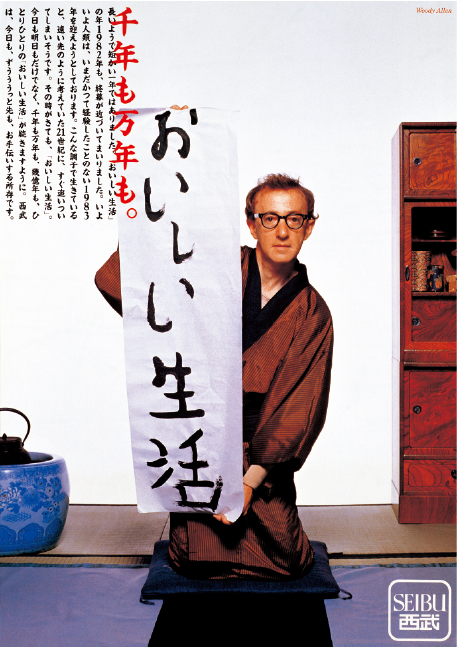
西武百貨店「おいしい生活」(1982年)
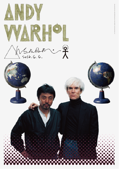
GRAPHIC TRIAL 2014 (2014年)
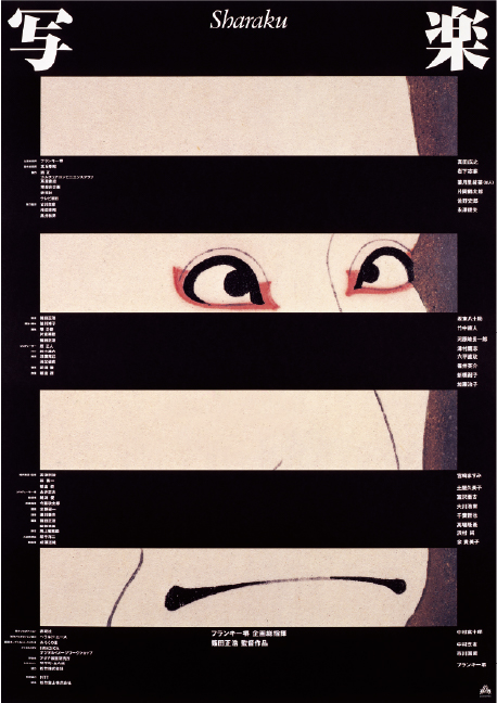
映画「写楽」(1994年)
異文化の文字体験を活かしたグラフィックデザインが、人と広告表現を育てていく。
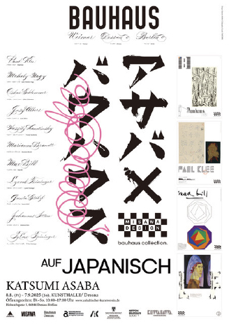
Katsumi Asaba Bauhaus
auf Japanisch (2025年)
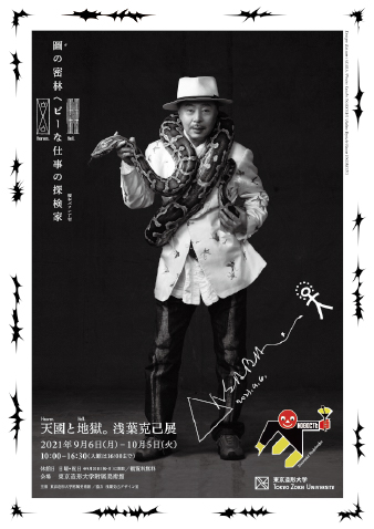
天国と地獄。浅葉克己展(2021年)
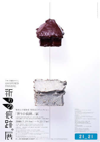
「祈りの痕跡。」展(2008年)
ステップインプラン(2003年)
トンパ文字に出会った浅葉さんは、その魅力を自分のグラフィックデザインに活かし始める。山は山の形に描かれ、その造形がそのまま意味になるこの文字は、近代的なフォントにはない根源的な表現の仕方が息づいている。それを自分の表現へと昇華していく。
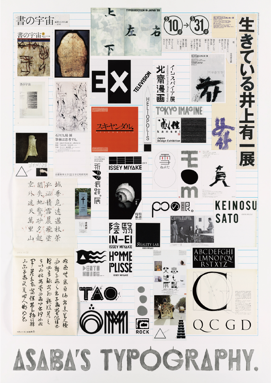
帰国後、浅葉さんが手がけた広告などのポスター作品は、文字を視覚造形として扱う独自の姿勢が一層鮮明になっていった。また、広告の現場にとどまらず、浅葉さんは展覧会を通じてトンパ文字の魅力を広めた。1990年「ギンザ・グラフィック・ギャラリー」の『アジアの文字』展では、アジア各地の文字を造形的にとらえた作品を発表し、その多様性と美を可視化。2008年には「21_21 DESIGN SIGHT」で『祈りの痕跡。』展を開催。現地で収集した経典や自作を展示するだけでなく、来場者が筆をとりトンパ文字の格言を書いて掛け軸に仕立てるワークショップを行った。観客は “見る文字” から “書く文字” へ体験を移し、浅葉さんの思想を身体で理解することになった。
また浅葉さんは日本のタイポグラフィをレベルアップさせるための活動も多くしている。1987年に設立した東京タイプディレクターズクラブでは、国際的なネットワークを構築しながら公募展や作品集を通して世界の文字表現を紹介し、タイポグラフィの新たな可能性を提示。浅葉さんはこの場を、文字を単なる実用フォントではなく文化的営みの象徴としてとらえるための拠点とした。
教育の場でも同様で、かつて多摩美術大学で教鞭をとっていた浅葉さんは講義において、学生にしばしば「文字は単なる技法ではない」と語りかけていた。文字は情報の器にとどまらず、人類の歴史や祈り、日常の痕跡を映し出す文化的存在である。そうした視点を繰り返し示しながら、若い世代にタイポグラフィを “造形のテクニック” ではなく “人間の営みを考える手がかり” として捉えることを促した。そこには、トンパ文字との出会いから得た洞察が脈打っているように思える。
展覧会や書籍以外で浅葉さんが手がけた広告やポスターに、トンパ文字そのものが描かれたことはなかった。しかし、トンパ文字に出会った以降の作品の多くには、“形が意味を先導する” というトンパ文字からの学びが確かに息づいている。
浅葉さんは広告を「情報の装置」としてではなく「生きた造形」として位置づけた。その姿勢は、地球文字探検家としての旅と、アートディレクターとしての営みが結びついた稀有な実践である。広告の枠を超えて、文字を文化の証として提示し続けた浅葉さんの仕事は、いまなおタイポグラフィの核心を問い直し、私たちに「生きた文字」の存在を思い起こさせている。
Graphic design informed by encounters with the scripts of other cultures cultivates both people and the language of advertising.
Upon encountering the Dongba script, Asaba began to integrate its unique appeal into his graphic design. This script, where form directly embodies meaning (a mountain is simply drawn as a mountain), held a primal expressiveness absent in modern fonts, which he sought to elevate into his own art.
After returning to Japan, his posters and advertisements showed an increasingly clear commitment to treating type as a powerful visual form. He also spread the allure of Dongba through exhibitions. Notably, his 2008 “Traces of Prayer” exhibition featured a workshop that fundamentally shifted the audience’s experience from passively “seeing characters” to actively “writing characters,” allowing them to physically embody Asaba’s deep conviction.
Asaba dedicated himself to raising the standard of Japanese typography. As a co-founder of the Tokyo Type Directors Club (TDC) in 1987, he introduced global typographic expression and championed the view of characters as cultural symbols, not mere functional tools.
Similarly, while teaching at Tama Art University, he emphasized that characters are not just technical skills, but cultural entities that reflect human history and prayer. He urged students to see typography as a “clue to understanding human endeavor.”
While the Dongba script itself rarely appeared in his commercial work, the core lesson that “form leads meaning” undeniably shaped his subsequent creations.
Asaba positioned advertising not as an “information device” but as a “living form.” This practice—a rare fusion of his life as a “character explorer” and his art direction—continues to challenge the core of typography and reminds us of the existence of “living characters.”
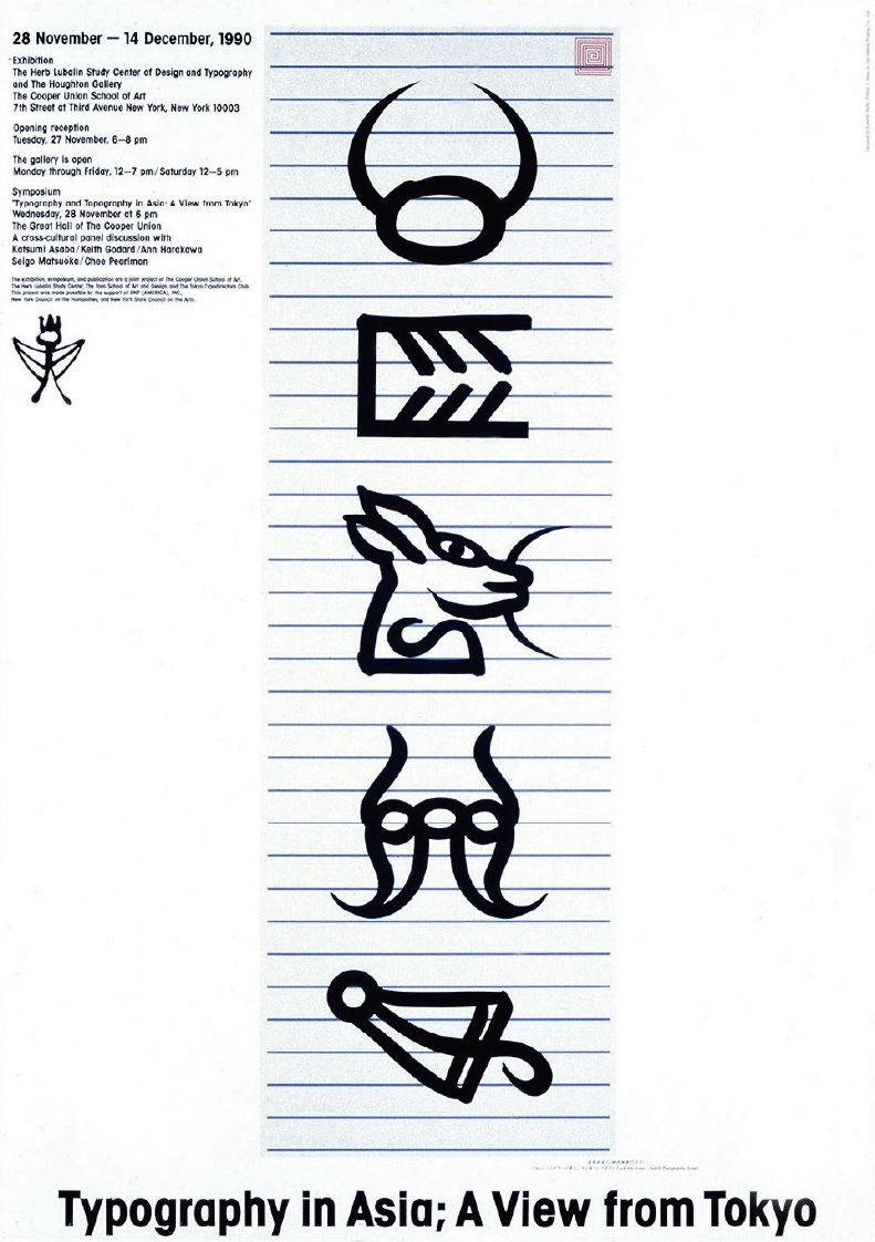
Typography in Asia: A View from Tokyo(1990年)
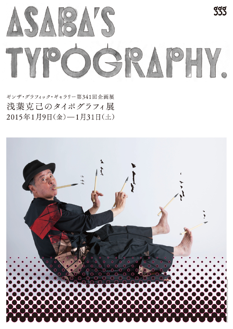
浅葉克己のタイポグラフィ展(2015年)
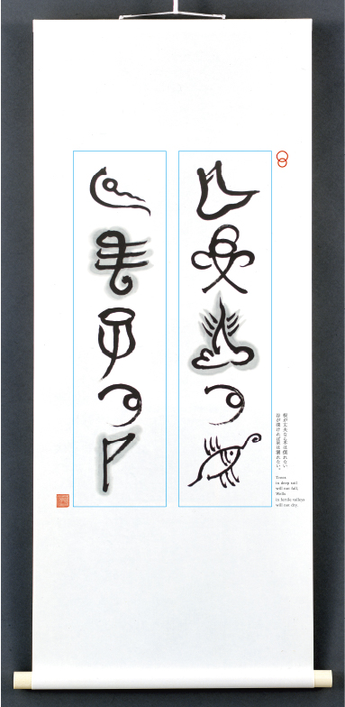
トンパ格言(2010年)
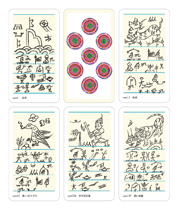
トンパタロットカード(2008年)
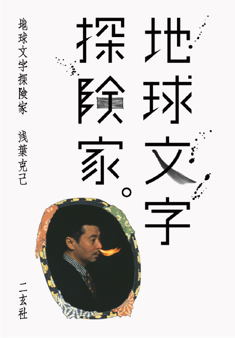
地球文字探検家。(2004年)
「書」とタイポグラフィを結び、浅葉克己の表現は多くのクリエイターに影響を与え続ける。
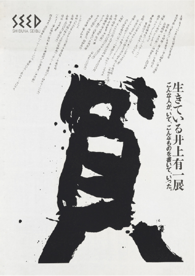
生きている井上有一展(1986年)
TBS 井上有一花(1988年)
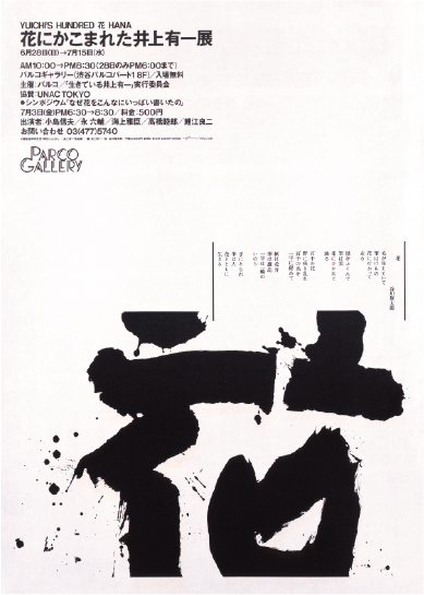
花にかこまれた井上有一展(1987年)
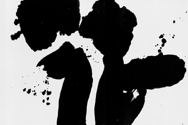
日本のグラフィックデザインを牽引してきた浅葉さんは、「書」への関わりも大切にしてきた。若い頃から漢字の骨格や古代文字の抽象化に魅せられたという浅葉さん。均整のとれた活字よりも、途切れ、滲み、掠れるといった変化を見せる「書」に惹かれていく。
そうした浅葉さんの「書」の探究を深めたのが書家である石川九楊。「書は文字ではなく言葉を書く芸術である」と捉える石川は、筆と紙の接点に生じる筆蝕 “速度・深度・角度・力” の体験性をこそ価値の源泉と説く。その思想に共鳴した浅葉さんは石川九楊の門下生となり、直接的に「書」の鍛錬を受ける。
トンパ文字、そして石川九楊との出会い。このことが浅葉さんのタイポグラフィに大きな影響を与え、そうして生まれた数々のポスターや広告作品は日本のグラフィックデザインを刺激し、進化させた。
浅葉さんのグラフィックデザインを見ると、「書」との関わりで目を惹くのが井上有一の書を使った『生きている井上有一』展のポスター。この頃、浅葉さんは糸井重里や緒形拳、中沢新一、細野晴臣らといったジャンルを越えた有志とともに「生きている井上有一の会」を結成。展覧会を開催させるなどで井上有一の「書」を世の中に広めた。
浅葉さんの大きな功績のひとつに、書とタイポグラフィを融合させたことがある。欧米的なモダンデザインが無機質な機能美を志向するのに対し、浅葉さんは「書」との関連をもったタイポグラフィにより、東洋的な精神性と身体性を前面に押し出した。「書」の持つアジア的な感覚をグラフィックデザインの土壌に根付かせたのだ。
浅葉さんと「書」の関係を振り返るとき、“文字を書く” という行為が、情報伝達にとどまらず、文化や精神を担う行為であることを改めて認識する。そして浅葉さんの作品は、未来に向けてもなお、「書」の力を現代のデザインに活かす可能性を指し示している。
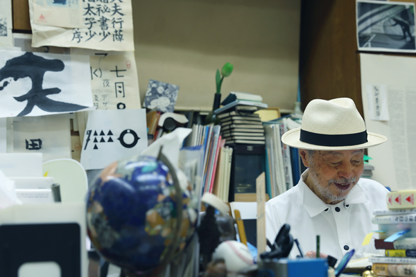
浅葉さんは現在も、日記や図のスケッチと並行して毎朝の臨書を日課とし、唐代楷書などの古典に挑み続けているという。ここでの鍛錬が、広告やポスターの一点に凝縮される決定的な線へと還流する。書は仕事の“裏”ではなく、仕事そのものを支える基礎体力なのだ。
そうして、浅葉さんが生み出す “じゆうな じ” はグラフィックデザインの未来を、これからも広げていく。
Bridging calligraphy and typography, Katsumi Asaba’s practice continues to shape generations of creators.
Asaba, a leader in Japanese graphic design, was deeply committed to calligraphy. He preferred the expressive, variable lines of shodō over uniform type, having been fascinated by the structure of ancient scripts since his youth.
Calligrapher Kyūyō Ishikawa deepened Asaba’s study. Ishikawa taught that shodō is the art of writing words, with its value lying in the physical experience of the brushstroke (speed, depth, angle, force). Asaba became his disciple to receive direct training.
The encounters with the Dongba script and Ishikawa greatly influenced Asaba’s typography, and his resulting posters and ads stimulated and evolved Japanese graphic design.
A key example is the poster for the Living Yu-ichi Inoue exhibition. Asaba formed an association with cross-genre enthusiasts to organize exhibitions and promote Inoue’s calligraphy to the public.
One of Asaba’s major achievements was the fusion of calligraphy and typography. While Euro-American modern design aimed for sterile, functional beauty, Asaba injected an Oriental spirituality and physicality through shodō-related typography, effectively rooting the Asian sensibility of calligraphy within the soil of graphic design.
Reflecting on Asaba’s relationship with shodō, we are reminded that the act of “writing characters” transcends mere information transfer to become an act that carries culture and spirit. His work continues to demonstrate the lasting potential for applying the power of calligraphy to contemporary design.
Even today, Asaba practices rinsho (copying classics) daily. This discipline becomes the decisive line in his work; calligraphy is the basic physical strength supporting his design.
The “Typography Unbound” he creates will continue to expand the future of graphic design.
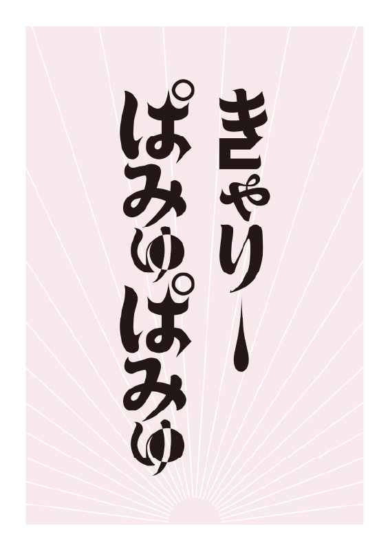
「きゃりーぱみゅぱみゅに捧ぐ」にほんごっ子(2013年)
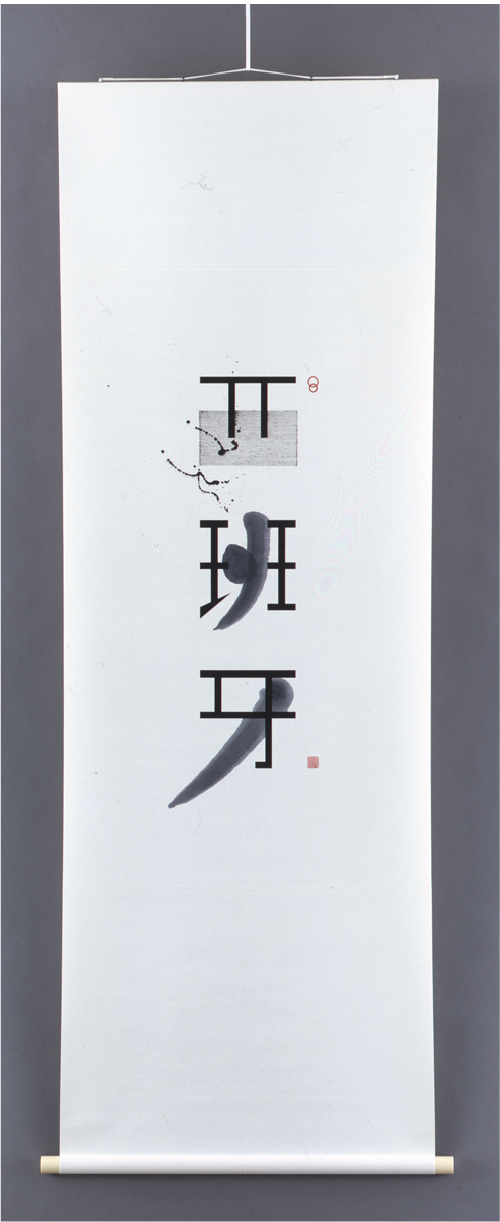
西班牙(2004年)
SABA’S COLLAGE. (2016年)

閲覧中の特集はこちら