


井上有一の書が広告を変えた時代。松濤美術館で体感する文字とデザインの響き。
Feature | 2025.10.24
日本の広告表現が大きく揺れ動いた1970年代から80年代、伝統的な「書」と現代的なグラフィックデザインはどのように響き合い、新しい表現の可能性を切り拓いたのか。その問いに応える展覧会が「井上有一の書と戦後グラフィックデザイン 1970s-1980s」。
没後40年を迎えた前衛書家・井上有一の仕事を軸に、当時のグラフィックデザイナーたちがどのように彼の書に触発され、広告やポスター、印刷物の中でそのエネルギーを翻訳していったのかを浮かび上がらせる展覧会となっている。
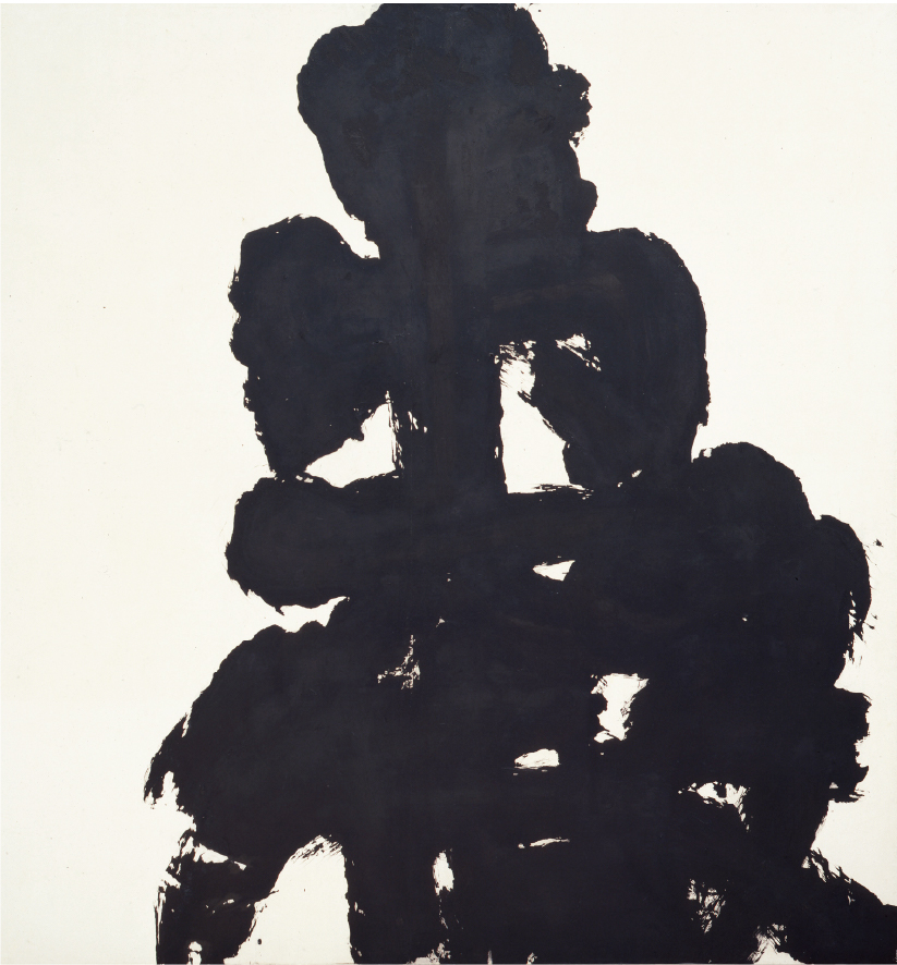
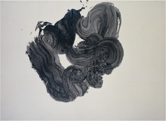
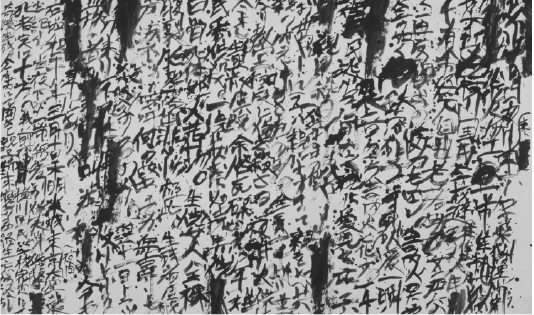
会場には、『貧』や『噫横川国民学校』をはじめとした代表作が並び、初期の『愚徹』『花』『母』なども含め、前期・後期で作品を数点入れ替えながら紹介される。
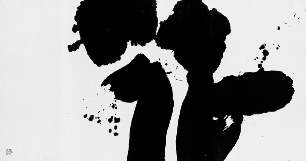
墨が紙に叩きつけられた瞬間をそのまま封じ込めたような作品は、伝統的な書の均整のとれた美とは一線を画し、観る者に生々しい衝撃を与える。さらに本展が注目するのは、こうした作品が美術館の中に留まるのではなく、1970年代から80年代の広告やグラフィックデザインの領域で強い影響力を発揮した点。
高度経済成長を背景に商業広告が洗練されていった時代、デザイナーたちは井上有一の「荒々しい線」「即興の痕跡」「墨の滴り」を広告表現に取り込み、消費社会へと強く、印象的な訴求を試みた。1986年には『生きている井上有一』展が開催され、また浅葉克己、緒形拳、細野晴臣ら様々な表現者が「生きている井上有一の会」を結成、井上有一の書を現代に蘇らせようとした。この動きのなかで制作されたパルコの「1986年正月/貧」ポスターは、井上有一の書を大胆に広告へ導入した象徴的な例。猛々しく、力強い、巨大な筆跡を相手にしたのはアートディレクターの井上嗣也。そしてコピーライターは糸井重里。当時を代表するクリエイターが井上有一の書という怪物と格闘し、完成度の高いグラフィック作品をつくりだした。
井上有一自身は「弟子を持たない」姿勢を貫いたといわれているが、その表現はグラフィックデザイナーをはじめとしたクリエイターたちによって引き継がれ、広告という公共空間の中で再生産された。
会場を巡ると、井上有一の作品がいかに広告表現の刷新に寄与したかが実感できる。整然としたモダンデザインの流れに抗うように現れた墨の勢いは、浅葉克己や福田繁雄らをはじめとする多くのデザイナーに強い刺激を与え、商業と芸術の間に新しい道筋を開いた。デジタル化が進み、整ったフォントが日常を埋め尽くす現代においてこそ、井上有一の生きた筆跡は新鮮で、広告やデザインが文字に託してきたメッセージの重みを再考させる。
単なる回顧展ではなく、書と広告が交わった豊穣な時代を追体験し、未来のデザインにおける文字表現の可能性を考える機会になる必見の展覧会だ。
The era when Yui-chi Inoue’s calligraphy transformed advertising.
Experience the resonance of characters and design at the Shoto Museum of Art.
From the 1970s to the 80s, a period of great change in Japanese advertising expression, how did traditional “sho” (calligraphy) and modern graphic design resonate with each other and pave the way for new possibilities in expression? An exhibition titled “INOUE Yu-ichi’s Calligraphy and Postwar Graphic Design in 1970s-1980s” seeks to answer this question.
Centered on the work of avant-garde calligrapher Inoue Yu-ichi, who passed away 40 years ago, the exhibition illuminates how graphic designers of the time were inspired by his calligraphy and translated its energy into advertisements, posters, and other printed materials.
The venue will feature his representative works, including “Hin” (Poverty) and “Aa Yokogawa Kokumin Gakko” (Ah, Yokogawa National School), along with early pieces like “Gutetsu” (Foolish Iron), “Hana” (Flower), and “Haha” (Mother), with some works being rotated between the first and second halves of the exhibition.
His works, which seem to encapsulate the very moment ink was slammed onto paper, stand in stark contrast to the balanced beauty of traditional calligraphy, delivering a raw and visceral shock to the viewer. This exhibition also draws attention to how these works didn’t remain confined to museums, but exerted a powerful influence on advertising and graphic design from the 1970s to the 80s.
In an era of sophisticated commercial advertising driven by rapid economic growth, designers incorporated INOUE Yu-ichi’s “rough lines,” “traces of improvisation,” and “ink drips” into their work,attempting to make a strong and impactful appeal to consumer society. In 1986, the exhibition “The Living INOUE Yu-ichi” was held, and various artists, including Katsumi Asaba, Ken Ogata, and Haruomi Hosono, formed the “The Living Inoue Yuichi Association” to bring his calligraphy back to life in the modern age.
The Parco poster for “1986 New Year / Poverty” created during this movement is an iconic example of the bold introduction of INOUE Yu-ichi’s calligraphy into advertising. The ad-art director, Tsugiya Inoue, and copywriter, Shigesato Itoi, challenged the fierce, powerful, and massive brushstrokes, creating a highly polished graphic piece.
Though INOUE Yu-ichi himself is said to have maintained a stance of “having no disciples,” his expression was carried on by graphic designers and other creators, and was reproduced within the public space of advertising.
As you walk through the venue, you will feel firsthand how INOUE Yu-ichi’s work contributed to the revitalization of advertising expression. The momentum of the ink, which appeared to defy the flow of neat modern design, provided strong inspiration for many designers, including Katsumi Asaba and Shigeo Fukuda, and opened a new path between commerce and art. In the present day, where digital technology and perfectly aligned fonts fill our lives, INOUE Yu-ichi’s lively brushstrokes feel fresh and prompt us to reconsider the weight of the messages that advertising and design have entrusted to words.
This is a must-see exhibition that is more than a simple retrospective; it’s an opportunity to re-experience a fertile period where calligraphy and advertising intersected, and to consider the possibilities of character expression in future design.
『井上有一の書と戦後グラフィックデザイン 1970s-1980s』
2025年9月6日(土)〜 2025年11月3日(月・祝)
前期:9月6日(土)~10月5日(日)
後期:10月7日(火)~11月3日(月・祝)
※会期中、一部展示替えあり
【休館日】
月曜日(ただし9月15日、10月13日、11月3日は開館)、
9月16日(火)、9月24日(水)、10月14日(火)

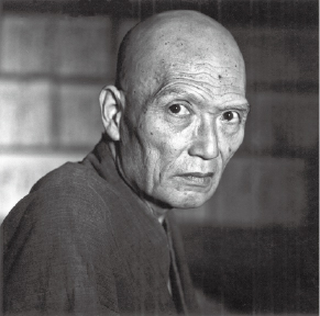
操上和美 《井上有一肖像》
1984年8月31日撮影 個人蔵
井上有一 《愚徹》 1956年 墨・紙 国立国際美術館蔵 Ⓒ UNAC TOKYO
井上有一 《母》
1961年 墨・紙 京都国立近代美術館蔵 Ⓒ UNAC TOKYO
井上有一 《噫横川国民学校》
1978年 墨・紙群馬県立近代美術館蔵 Ⓒ UNAC TOKYO
井上有一 《花》 1957年 墨・紙 個人蔵 Ⓒ UNAC TOKYO
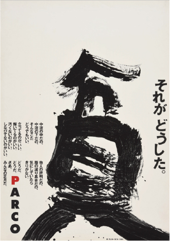
井上嗣也「1986年正月/貧」ポスター、
1986年 AD・D:井上嗣也
A:井上有一(ウナックトウキョウ)
C:糸井重里 PL:對馬壽雄
ADV:パルコ 個人蔵
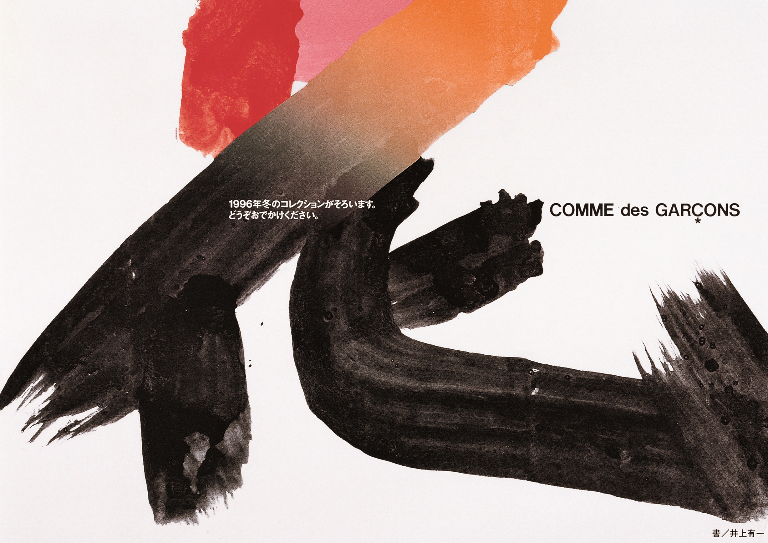
井上嗣也「COMME des GARÇONS
’96-’97AUTUMN WINTER DM」
1996年 AD・D:井上嗣也
A:井上有一(ウナックトウキョウ) CD:川久保玲
ADV:COMME des GARÇONS
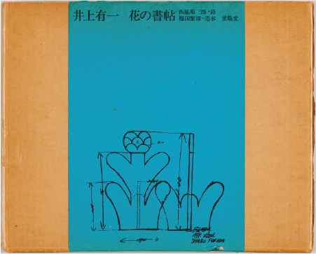
井上有一著・福田繁雄造本『花の書帖』求龍堂
1971年 個人蔵

閲覧中の特集はこちら