
創造の源泉。
創造の源泉。
創造は、どこから生まれるのだろう、という話。
創造の源泉。
The Wellspring of Creativity.
Feature | 2026.4.22
創造は、どこから生まれるのだろう、という話。
近頃、アール・ブリュットやアウトサイダー・アートと呼ばれる表現が注目されている。
見る人の心に直接触れてくる、不思議な力がある作品たち。
その魅力を「障害のある人のアート」としてではなく、
一人の作り手として作品を見つめたら、
そこにはどんな創造の源泉が立ち現れるのだろう。
今回の特集では、画家・浅井力也さんと
クリエイティブカンパニー「ヘラルボニー」を訪ねた。
障害のある個人の創作と、それを社会へひらく仕組み。
その二つの現場にある創造が生まれる場所を、
少しだけのぞいてみたいと思う。
On where creativity comes from.
Lately, there has been a growing fascination with “Art Brut”
and “Outsider Art”—works that possess a raw,
magnetic power capable of speaking directly to the viewer’s soul.
But what if we moved beyond the label of “disability art”
and instead viewed these pieces through the eyes of the creator?
What hidden wellsprings of inspiration
would we then discover? In this feature,
we journey into the worlds of painter Rikiya Asai and
the innovative creative company HERALBONY.
By exploring both the intimate act of personal creation
and the systems that bridge it with society,
we seek to uncover the very essence of where creativity begins.
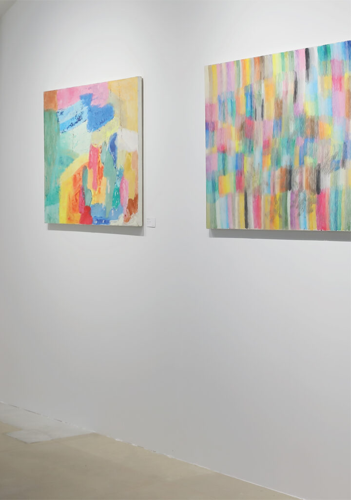
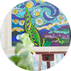
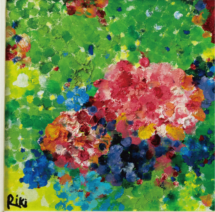
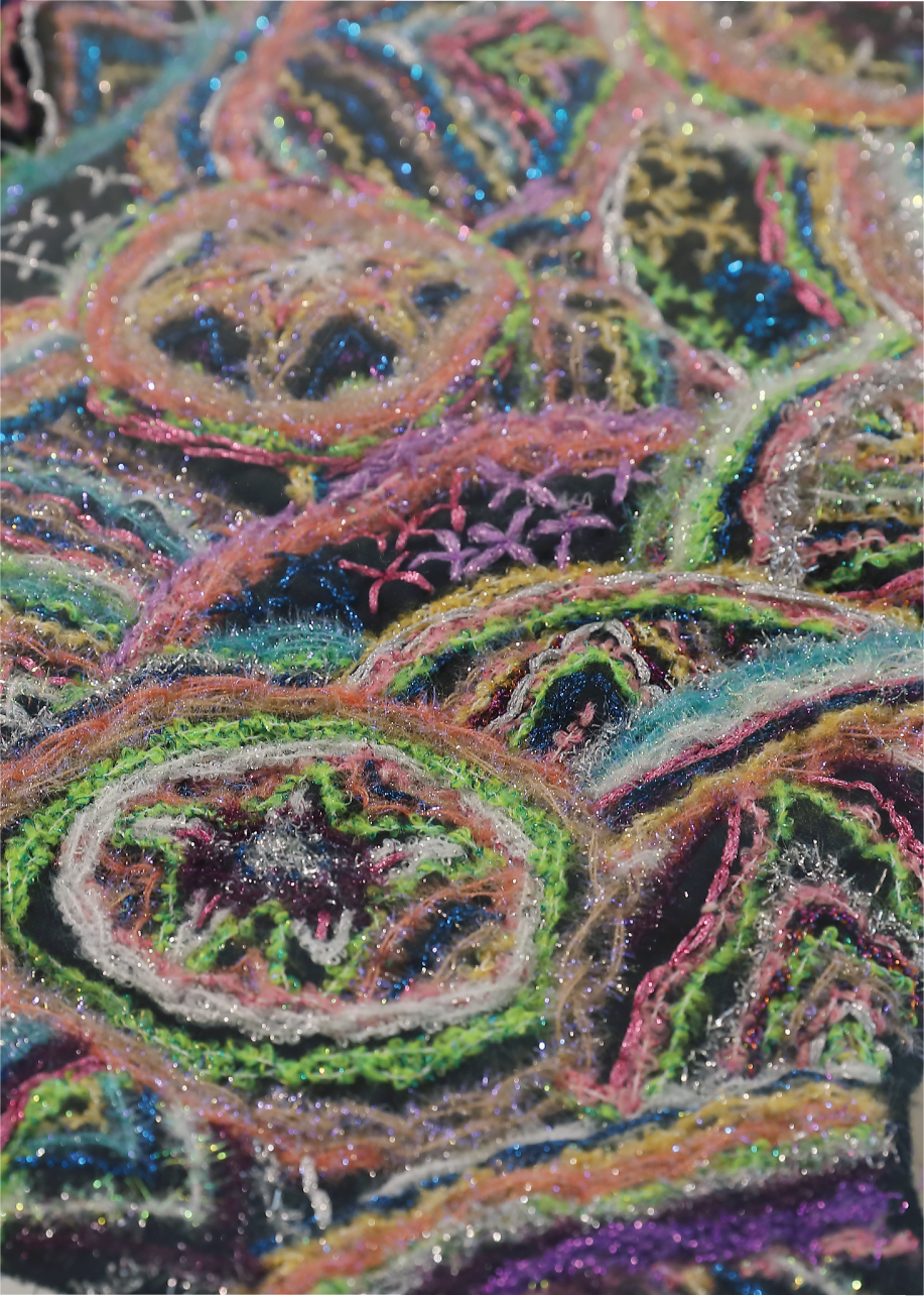
左:作品名「SWYY. No.21」 作家名「岡部 志士」 右:作品名「 Scratch Works Yay !Yay ! No.1 」 作家名「岡部 志士」いま、障害のある人たちの表現に、静かな注目が集まりはじめている。
アール・ブリュット、アウトサイダー・アート・・・。
さまざまな呼び名で語られるその作品は、
既存の技法や評価の枠を軽やかに越え、見る者の感覚に直接触れてくる。
しかし、その魅力を「障害のある人のアート」として語るだけでいいのか。
ラベルを外し、一人の作り手として向き合ったとき、そこにはどんな創造が立ち現れるのか。
本特集では、画家・浅井力也さんとクリエイティブカンパニー「ヘラルボニー」を訪ね、
その源をたどる。
A growing interest in the creative expression of people with disabilities is quietly emerging.
Art brut, outsider art…
These works, spoken of under various names,
lightly transcend existing techniques and evaluative frameworks, and speak directly to the viewer’s senses.
But is it enough to describe their appeal simply as “art by people with disabilities”?
When we remove the label and engage with each person as an individual creator,
what kind of creativity comes into view?
In this feature, we visit painter Rikiya Asai and the creative company HERALBONY to trace its source.
近頃、アール・ブリュットやアウトサイダー・アートと呼ばれる表現が注目されている。その中で、障害のある創り手の作品にも強い視線が向けられている。彼らの作品は、なぜこれほどまでに人の心を惹きつけるのだろうか。そこには、ピュアな感性が息づいているからなのかもしれない。既存の美術教育や技法、評価の基準から少し距離を置き、内側から湧き上がる衝動のままに生まれる色や形。その自由さが、見る者の感覚を揺さぶるのだろう。
しかし、その魅力を「障害のある人の表現だから」と説明してしまうのは、どこか違う気もする。もし、障害を障害として捉えず作品を見つめたらどうなるだろう。そこには、これまで見過ごしてきた新しい感性が見えてくるのではないだろうか。
その答えを探るために2カ所の取材先へ向かった。
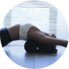
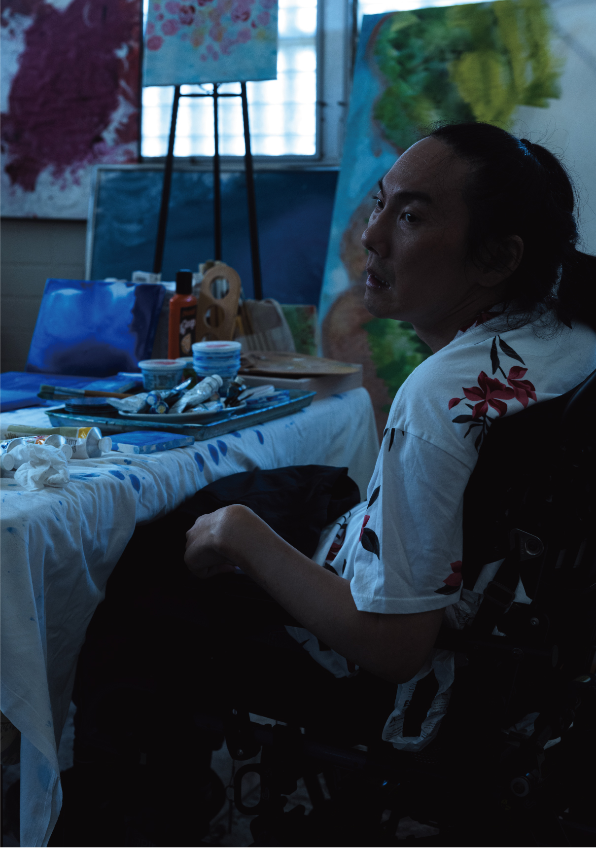
ひとつは、画家・浅井力也さん。通称 リッキー。脳性麻痺という身体的特性を持ちながら、ハワイの光や海の色に育まれ、独自の色彩世界を描き続けているアーティスト。筆だけに頼らず、指や身の回りの道具を使いながら、偶然生まれる形や質感を取り込み、自由な絵画を生み出していく。その作品には、既存の技法や常識を軽やかに越えていく感覚が息づいている。
もうひとつは、クリエイティブカンパニー「ヘラルボニー」。障害のある作家の作品を起点に、アパレルやプロダクトを展開しているブランド。彼らが掲げているのは「障害者支援企業」ではなく、「クリエイティブカンパニー」という立場だ。作家の創造を社会へひらき、作品と人、アートと日常を結び直していく。その活動は、作品の魅力をより多くの人の生活へ届け、新しい文化の風景を生み出している。
リッキーの絵画も、ヘラルボニーのプロダクトも、「障害」という言葉の枠の中に収まるものではない。そこにあるのは、人が世界を感じ取り、形にしようとする創造そのものだ。
創造は、どこから生まれるのか。その問いを胸に、2つの現場を訪ねた。創造の源泉へ。
Recently, a spotlight has been shining on “Art Brut” and “Outsider Art,” with works by creators with disabilities drawing particular fascination. What is it about these pieces that captivates us so deeply? Perhaps it is the raw, unadulterated sensibility that breathes within them. Distant from formal art education or conventional standards, these colors and forms emerge from a primal, internal impulse. This sheer freedom is what stirs the viewer’s soul. Yet, to define their charm simply as “art by the disabled” feels inadequate. What if we looked past the disability and focused solely on the work? In doing so, we might finally see the vibrant, new sensibilities we have overlooked for so long. To find the answer, we visited two very different creative frontiers.
The first is painter Rikiya Asai, affectionately known as Ricky. An artist with cerebral palsy, his vibrant and unique world of color has been nurtured by the radiant light and coastal hues of Hawaii. Eschewing traditional brushes for his fingers and various everyday tools, he embraces accidental shapes and textures to produce spontaneous, liberated works that effortlessly transcend conventional techniques and expectations.
The second is the creative company HERALBONY, a brand that transforms the work of artists with disabilities into high-end apparel and lifestyle products. Defining themselves as a “creative company” rather than a social welfare enterprise, they bridge the gap between art and the everyday, weaving the brilliance of these creators into the fabric of society.
Ultimately, neither Ricky’s paintings nor HERALBONY’s products are defined by the label of “disability.” Instead, they embody the very essence of human creativity—the primal urge to perceive the world and give it form. To uncover the true source of this inspiration, we journeyed to these two creative frontiers. Toward the wellspring of creation.
多彩な色が豊かな言葉になるとき。リッキーという画家の原点。
The Wellspring of Creativity.
Feature | 2026.4.22
《画家》
浅井力也 Rikiya Asai
脳性麻痺の治療のため、4歳の時にハワイに移住。
この頃から絵具に興味を持ち始め、絵を描き始める。
6歳でハワイ美術院展に絵が入賞したことをきっかけに、世界各地で個展やワークショップを開催。
個性あふれるメッセージ性の強いアートワークが、国際的にも高く評価されている。
1999年
浅井力也画・浅井三和子文「キヤンバス」(いのちのことば社)刊行。
2001年
9・11の直後、ニューヨークでの「ピースアート展」100人のアーティストの1人として招待され「僕のスターウォーズ」を発表。
2002年
文部省検定小学校1年~6年国語の教科書(学校図書株式会社)の表紙に12作品が採用される。
2014年
New York国連本部へ日本代表で招集され、第65回国連DPI-NGO年次大会”Health, Freedom and Human Rights of the Disabled”会議へゲストパネリストスピーカーとして特別出席。
現在、世界各地で作品を発表しているアーティスト、浅井力也さん。通称 リッキー。その創作の原点をたどると、幼少期に暮らしたハワイの光と色、そして母の静かなまなざしに行き着く。
リッキーが初めて海を渡ったのは4歳のころ。それ以前、彼は日本で入退院を繰り返すほど体が弱く、週に一度は熱を出すような状態だったという。肺炎になることもあり、家族にとっては心配の尽きない日々。夜中に熱が上がり、急いで病院へ向かうことも珍しくなかったそうだ。
そんななか、母である三和子さんはある決断をする。暖かい場所に連れて行ってみよう―。そうして向かったのがサイパンだった。日本から3時間ほどで行ける距離。もし体調が悪くなっても、すぐに帰国できるという安心もあった。
2週間ほどの滞在のつもりだった。しかし、そこで思いがけない出来事が起こる。なんと、リッキーは一度も熱を出さなかった。穏やかな気候が体に合ったのかもしれない。海辺の風に吹かれながら過ごす時間のなかで、体調はゆっくりと安定していった。家族にとって、それは小さな奇跡のように感じられた。
そんなサイパンのビーチで、ひとりのアメリカ人男性が声をかけてきた。スミス氏という人物だった。実は彼は機能訓練の資格を持つ専門家で、その後、三和子さんの自宅にも足を運び、継続的にリッキーを指導してくれるようになった。
ある日、スミス氏はハワイのシュライナーズ病院の医師を紹介。リッキーは、子どもの医療で知られるこの病院で診察を受けることになった。シュライナーズ病院はアメリカ各地にある小児専門病院で、治療費を基本的に無料で提供している施設だった。
当時、リッキーの足の筋肉は手術の必要があるといわれていたが、シュライナーズ病院での診察の結果は違い、リハビリの効果で筋肉は改善しており、手術は必要ないという判断だった。家族にとって、それは胸をなでおろす瞬間だった。
この出来事がきっかけとなり、家族はハワイで暮らすことを決める。見知らぬ土地、しかしそこには子どもを受け入れてくれる温かな空気があった。
家の近くにはトーマス・ジェファーソン小学校という学校があった。幼稚園と小学校が併設された校舎。親子はよく、その学校を外から眺めていたという。校庭で遊ぶ子どもたちの声を聞きながら、いつかここで学べたらと考えていた。
ある日、副校長が声をかけてきた。「学校に興味があるのですか」。事情を話すと、彼はそのまま教室へ案内してくれた。本来ならビザがなければ入学はできない。しかし副校長はこう言った、「子どもが幸せに学べることが一番大事です」。制度よりも子どもの可能性を大切にする。その言葉に、三和子さんはアメリカの教育の懐の深さを感じたという。こうしてリッキーは、ハワイでの学校生活を始めた。
その頃から、リッキーは絵の具に強い興味を示すようになる。最初は幼稚園のお絵描きだったが、やがて色そのものに夢中になった。おもちゃ屋で買った絵の具に指を入れ、叩き、広げる。その動きのなかで、色は彼の感情を語る手段になっていく。
言葉の少ない子どもだったリッキーにとって、色は心のバロメーターだった。暗い色を使う日は体調がすぐれず、明るい色を選ぶ日は気持ちが弾んでいる。三和子さんは、その変化を日記に書き留めていたという。色が心と深く結びついていることに、少しずつ気づいていった。
リッキーが描く絵は、彼の内側の世界を映す窓になっていった。色を重ねるたびに、言葉にならない思いが少しずつ外の世界へと現れていった。その色は、やがて彼だけの自由な創作へと広がっていく。
When a riot of color becomes a rich language.
The origin of the painter Ricky.
Today, Rikiya Asai—or Ricky—is a celebrated artist whose soulful works reach audiences globally. His creative journey began with the radiant light of Hawaii and the steady devotion of his mother, Miwako.
Before age four, Ricky’s life in Japan was a cycle of frailty and frequent hospitalizations. Plagued by weekly fevers and recurring pneumonia, his health was a constant source of anxiety for his family, often leading to frantic midnight trips to the emergency room. Seeking a breakthrough, Miwako made a pivotal decision: “Let us take him somewhere warm.”
They chose Saipan, only three hours from Japan. What was meant to be a short stay became a miracle: in the mild climate and seaside breeze, Ricky did not suffer a single fever. His health finally stabilized, a gift that felt like a divine intervention. On a Saipan beach, they met Mr. Smith, a physical therapy specialist who began providing Ricky with consistent guidance.
He eventually introduced them to Shriners Hospital in Hawaii. While previous medical opinions insisted Ricky’s legs required surgery, the specialists at Shriners delivered a life-changing diagnosis: through persistent rehabilitation, his muscles had improved enough that surgery was unnecessary. For Ricky and his family, this moment of overwhelming relief opened a new chapter, leading to the vibrant world he paints today.
This sequence of events led the family to a life-altering decision: they would move to Hawaii. Though it was an unfamiliar land, they found a warm, inclusive atmosphere that embraced children. Near their new home stood Thomas Jefferson Elementary School. Miwako and Ricky often stood outside, watching the students and listening to their voices, secretly hoping that he might one day join them. One day, the vice principal noticed them and asked, “Are you interested in our school?” Upon hearing their situation, he welcomed them inside. Despite the lack of a formal visa at the time, he stated firmly, “The most important thing is for a child to learn happily.” His willingness to prioritize a child’s potential over rigid regulations deeply moved Miwako, revealing the profound depth and compassion of American education.
In this supportive environment, Ricky began to show a passionate interest in paint. What started as simple preschool drawings soon became a fascination with color itself. He would dip his fingers into vibrant pigments, striking and spreading them across the paper. For a child who spoke very few words, these colors became a vital means of communication—a “barometer of the heart.” Miwako noticed that on days when he felt unwell, he reached for darker tones, while bright hues signaled a joyful spirit. She meticulously recorded these emotional shifts in her diary, realizing that color and soul were deeply intertwined. Ricky’s paintings became windows into his inner world, where layers of unspoken thoughts finally found their way out, evolving into the uniquely free and vivid creations he shares with the world today.
海の色、空の色。ハワイ、自由な創作が生まれる場所。
The Wellspring of Creativity.
Feature | 2026.4.22
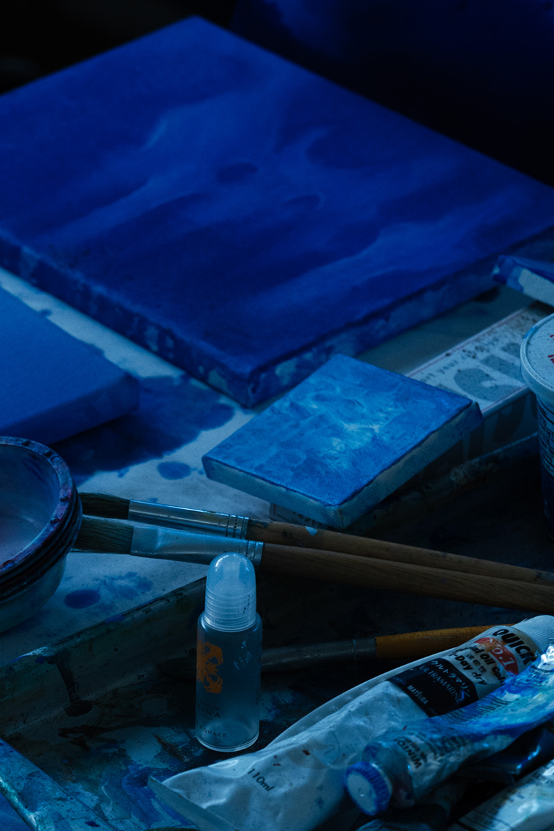
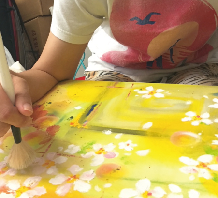
リッキーの絵には、ひとつの特徴がある。それは、道具に縛られない自由な表現。
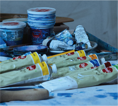
最初は指で色を塗ることから始まった。やがてリッキーは、身の回りのさまざまなものを使うようになる。スプーン、スポンジ、ボール。ときには野菜まで道具になる。人参や大根、リンゴを絵の具につけ、キャンバスに押し当てる。そこから偶然生まれる形や質感が、新しい表現につながっていった。
普通なら「それは食べ物でしょう」と止めてしまうかもしれない。しかし母の三和子さんは、リッキーの発想を制限することはなかった。子どもが何に興味を持つのかを見守り、その可能性を広げていく。それが三和子さんの基本姿勢だったのだ。
ある日、描きためた作品を画材店に持ち込んだとき、店主は驚いた。「これは誰の先生の絵ですか」。そう尋ねられた三和子さんが「息子の絵です」と答えると、店主は「素晴らしい!」と言って額装を勧めてくれた。その言葉は、家族にとって大きな励ましになった。
その後、油絵の具の使用にもチャレンジし、リッキーの表現の幅はさらに広がっていく。筆に限らず、身の回りのものすべてが道具になるという発想は、この頃から育っていった。
こうして8歳のとき、リッキーは初めての個展を開くことになる。小さな会場ではあったが、壁に並んだ絵はどれも色に満ち、見る人の目を引いた。子どもの作品でありながら、どこか独特の世界観があったことが、人の心を惹きつけていた。
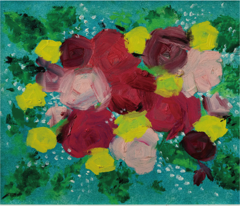
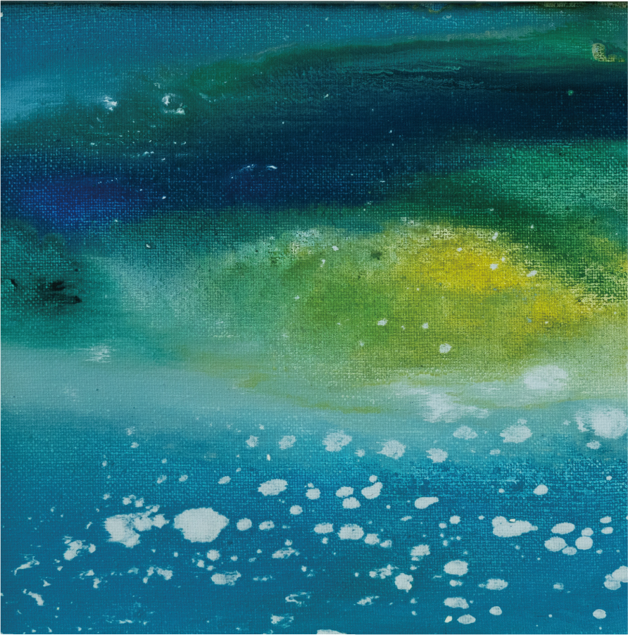
彼の感性を育てたものは、絵の具だけではない。ハワイの自然そのものが、大きな影響を与えている。ハワイの海は、時間によって色を変える。青から緑へ、そして紫へ。七色に変わるともいわれる海の色を、彼は日常の風景として見て育っている。
家の窓から海が見える生活。朝の光に照らされた水面、夕暮れに染まる空。時間とともに変わる海と空の色は、リッキーの色彩感覚を豊かに育てていった。まるで自然そのものが絵の具の見本帳のようなものだったのかもしれない。
さらに、父の拠点があるアメリカ本土では、山や森の自然にも触れた。鹿やバッファローなど野生動物が暮らす広大な景色。ハワイの海とアメリカ本土の山、まったく異なる風景を体験しながら育ったことが、彼の表現に奥行きを与えた。
芸術的な刺激は舞台からも得ていた。三和子さんは幼いころから、リッキーをミュージカルやオーケストラの演奏会に連れて行った。舞台の光、音楽、衣装の色彩。そうした総合的な表現は、彼の感覚を強く刺激した。こうした舞台の鮮やかな色彩や照明の変化は、のちに作品の色づかいにも影響を与えている。
現在もリッキーの制作のスタイルは変わらない。描きたいときに描き、描きたくないときは描かない。数か月、あるいは一年描かないこともあるという。それでも、再びキャンバスに向かうとき、新しい色が生まれる。描かない時間もまた、リッキーにとっては大切な創作の一部なのかもしれない。
リッキーは、ときには同じ花を見ても、実際の色とは違う色で描くことがある。赤いバラを青で描いたり、ピンクの花を紫で描いたりすることも。しかしそれは間違いではなく、そのとき彼が感じた感情の色なのだという。色は単なる視覚ではなく、心の温度を映すもの。
三和子さんは言う、「子どもが何を好きなのか、何をしたいのかを、同じ目線で考えてあげてほしいのです」と。そして、できるだけ多くの場所に連れて行ってあげてほしいとも言う。数字や成績だけで子どもを見ないこと。多様な世界を見せること。それが子どもの感性を育てる。
リッキーの絵には、そうした経験のすべてが息づいている。海の色、空の色、そして自由な発想。言葉よりも先に色や形が物語る。その作品は、世界をやさしく見つめる視線の記録なのかもしれない。
The colors of the sea, the colors of the sky.
Hawaii, the birthplace of free creativity.
A hallmark of Ricky’s art is his absolute freedom from traditional tools. Starting with finger painting, he soon incorporated spoons, sponges, and even fresh vegetables. By pressing painted carrots or apples onto the canvas, he discovered spontaneous textures that led to new modes of expression. While many would have stopped a child from “playing with food,” his mother, Miwako, never restricted his imagination. Her philosophy was to observe his curiosity and nurture its potential without judgment.
This support bore fruit when Miwako took Ricky’s work to an art store. The owner was stunned, asking, “Which master painted these?” Learning they were by her young son, his praise and recommendation to frame them gave the family immense confidence. Ricky soon embraced oil paints, firmly believing that anything in his reach could be a tool.
By age eight, Ricky held his first solo exhibition. The walls were alive with colors that captivated every visitor; there was a sophisticated worldview in his work that transcended his age. This sensibility was nurtured by Hawaii’s nature. Living with a constant view of the sea, Ricky watched the water transform through seven hues—from emerald to deep purple. These shifting colors of the ocean and twilight skies served as his daily scenery, acting as a living color palette that forever enriched his vision.
Ricky’s creative horizons were further expanded in the American mainland, where he explored majestic mountains and forests inhabited by wild deer and buffalo. Growing up between the radiant tropical seas of Hawaii and the vast wilderness of the mainland provided his artistic expression with an extraordinary sense of depth. Beyond nature, he found profound inspiration in the performing arts; from a very young age, Miwako took him to live musicals and orchestral concerts. The dramatic stage lighting, the evocative music, and the vivid colors of the costumes deeply influenced the bold and imaginative palettes he uses in his artwork today.
His creative process remains intuitive: he only picks up a brush when the inner urge truly strikes, sometimes stepping away from the canvas for an entire year. For Ricky, these long pauses are an essential part of his journey. He often paints subjects in non-literal colors—imagining a rose in shades of blue or a lily in deep purple—to reflect the “temperature” of his emotions rather than visual reality. To him, color is a mirror that captures the shifting weather of the human heart.
Miwako believes in nurturing this unique spirit by seeing the world through a child’s eyes. She encourages parents to expose children to diverse environments, rather than judging their potential by grades or numbers. Ricky’s art is a living testament to this philosophy, breathing with the light of the ocean, the shadows of the forest, and the rhythm of the stage. Each of his canvases serves as a gentle record of how he perceives and embraces the beauty of the world around him.
作家の創造を社会へひらく、ヘラルボニーの思想。
The Wellspring of Creativity.
Feature | 2026.4.22
背景作品: 作家名「井口 直人」(左)黒澤浩美 Hiromi Kurosawa
最高芸術責任者/CAO(Chief Art Officer)
ボストン大学卒業後、水戸芸術館などを経て、
2003年より金沢21世紀美術館に参加し、約20年間キュレーターを務める。
国内外の現代美術作家による展覧会も多数企画。
2011年City Net Asia(ソウル)、
2017年OpenArt(スウェーデン)などで総合キュレーターを歴任。
2022年7月よりヘラルボニーに参画し、
2025年4月よりCAO(Chief Art Officer)に就任。
(右)大平稔 Minoru Ohira
リテールディレクター
2000年、アパレルメーカー小売のトゥモローランドに新卒入社。
24年間にわたり、店舗運営、レディース・メンズ商品部、
リテール百貨店営業、フランチャイズ部など、
アパレル小売業の幅広い業務を経験。2024年10月、
ヘラルボニーへ入社。
リテールディレクターとして、プロダクト開発や実店舗運営を担当している。
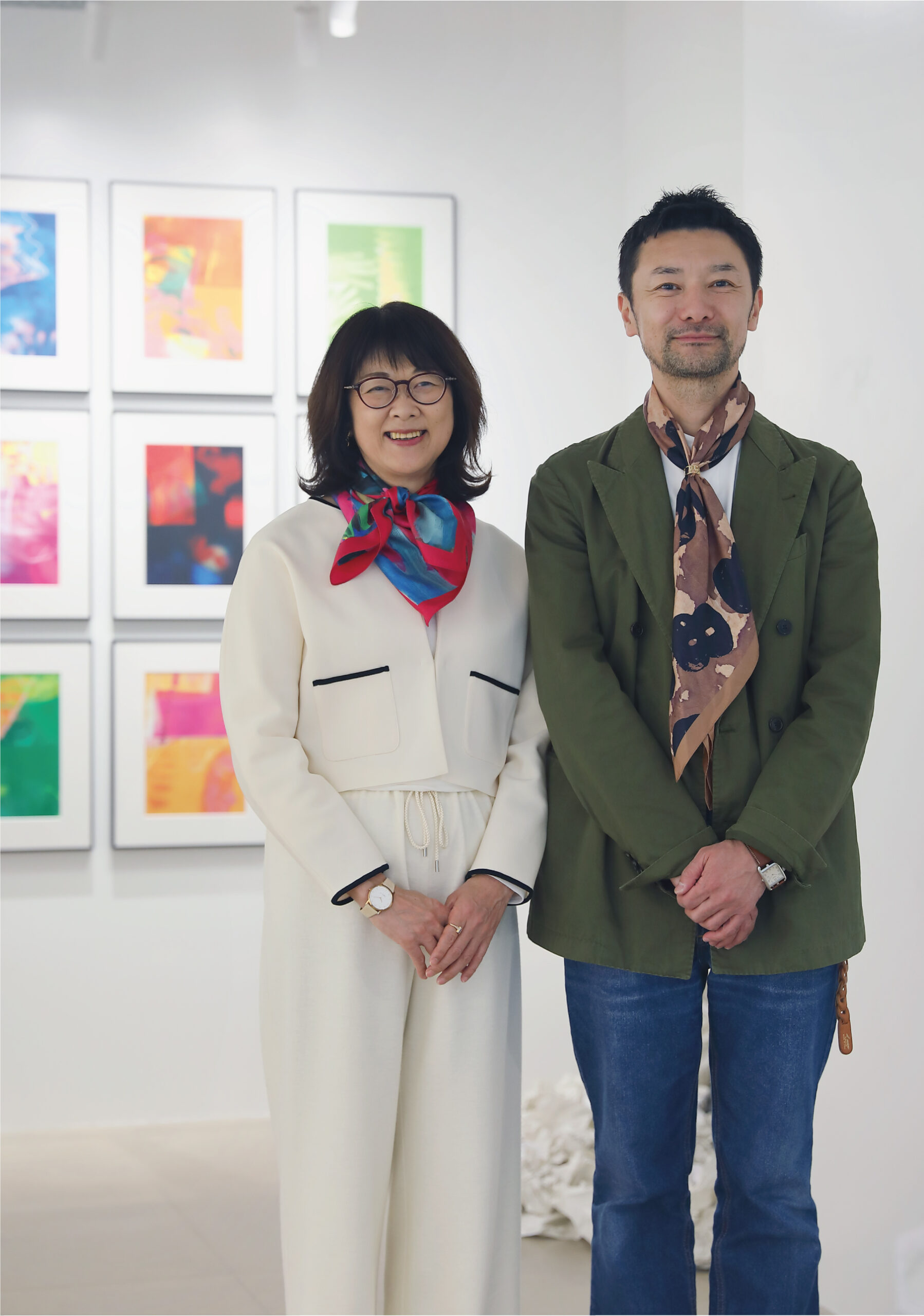
創造とは、どこから生まれるのだろう。特別な才能を持つ人のなかにだけあるものなのか、それとも誰のなかにも流れているものなのか。ヘラルボニーの活動を見つめていると、そんな問いが浮かび上がってくる。
そこで『創造の源泉』をテーマに、ヘラルボニーのChief Art Officer・黒澤浩美さんとRetail Director・大平稔さんに話をうかがった。
ヘラルボニーは自らを「障害者支援企業」ではなく、「クリエイティブカンパニー」と呼ぶ。黒澤さんは、その違いをこう語る。「これまで多くの場合、障害のある方たちには“何かをしてあげる”という関係が前提になっていました。でも私たちは、その関係を逆転させたいと思っています。 作家の方たちこそが主役で、私たちの活動はその方たちに支えられている。そういう関係です」。
作家が持つ創造を受け取り、それを社会へ広げていく。そのあり方こそがヘラルボニーの言うクリエイティブなのだ。
さらに黒澤さんは、アートという言葉をとても広い意味で捉えている。「私たちは、生きることそのものがアートだと思っています。朝起きて、今日は気持ちがいいと感じることも、空の色や風の匂いに心が動くことも。そういう感覚って、誰の中にもあるものですよね。作品として形になるものだけじゃなくて、人がどう感じて生きているかということ自体が、すでに創造だと思っています」。
黒澤さんは、長く現代美術の世界に身を置いてきた経験から、いまの時代の変化をこう見る。「いまは、作品の良し悪しだけではなくて、人がどんな営みをしているのか、どういう存在として世界と関わっているのか、そういうところに価値が移りつつある気がします」。
その思想は、プロダクトづくりの現場にも貫かれている。大平さんは、アートを商品へ翻訳する工程について丁寧に説明してくれた。「原画をプロダクトにするときには、どうしても見え方が違ってくるんです。紙に表現された色が布になると変わりますし、平面の作品が立体になると、隠れてしまう部分も出てきます」。
だからヘラルボニーでは、生産前に必ず作家本人や家族、施設に確認を取る工程を設けている。「必ず“この見え方で大丈夫でしょうか”と確認します。“この切り取り方では意味が変わる”と言われれば作り直しますし、場合によっては商品化しないこともあります」。
効率だけを考えれば、もっと速く作ることもできる。しかしヘラルボニーでは、作品の尊厳を守ることを最優先にしている。
実際、作家たちのこだわりは具体的だ。色の再現について細かく指摘する人もいれば、文字や数字の連なり方に意味を持たせている作家もいる。船を描いた作品なら、船首が欠ける切り取り方は許されない。名刺入れの柄を配置する際にも、船の形がきちんと見えるように合わせなければならない。
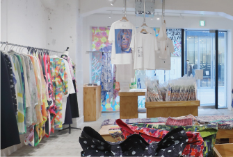
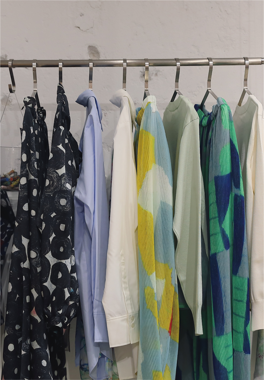
大平さんは、そうしたやり取りをこう表現する。「私たちはデザインを作っているというより、“翻訳”している感覚に近いんです。原画の魅力をどう別の形に変えて、日常の中に届けていくかを考えているんです」。
原画は一点しかない。作家と原画がその中心にある。しかし、その魅力を原画のまま届けられる人は限られている。だからこそ別の形へと翻訳し、より多くの人の生活へ届けていく必要がある。「スカートの柄になったり、スカーフになったり、日常の中で作品に出会えるようになる。そうすることで、原画とはまた違う形で作品が生き始めるんです」。
ヘラルボニーのクリエイティブとは、ゼロから何かを作ることではない。すでにある創造を見つけ、それを対話によって増幅させ、社会へ送り出していくこと。そんな仕事の積み重ねが、ここにはある。
HERALBONY’s vision:
Opening artists’ creativity to society.
Where exactly is creativity born? Is it a rare gift reserved for the few, or a natural current flowing through us all? Observing HERALBONY’s activities brings these profound questions to light. At HERALBONY, the identity is clear: they are a “creative company,” not a “support organization.” Chief Art Officer Hiromi Kurosawa describes a vital shift in perspective: “Traditionally, the premise was ‘doing something for’ people with disabilities. We want to invert that. The artists are the protagonists; our activities are supported by their vision.” By receiving their creativity and opening it to society, HERALBONY redefines what it means to be truly creative.
Kurosawa views art through an expansive lens, believing that the very act of living is art itself. Moving moments—feeling the morning air or the scent of the wind—are inherent in everyone. “It’s not just about the finished piece,” she explains. “Creativity is found in how a person perceives and exists within the world.” With her deep roots in contemporary art, she senses a global shift in value: away from mere technical merit and toward the human narrative and how an individual engages with the world.
This philosophy is meticulously woven into their physical products. Retail Director Minoru Ohira explains the delicate process of “translating” art into merchandise. “When transforming an original painting into a product, the appearance inevitably shifts. Colors on paper react differently on fabric, and flat works take on new dimensions—and hidden spaces—when they become three-dimensional objects.”
This commitment to the artist’s vision is why HERALBONY maintains a rigorous verification process, consulting with the artists, their families, or their support facilities before any production begins. They consistently ask, “Is this specific presentation acceptable?” If a particular crop or layout is felt to alter the inherent meaning of the work, the design is redone from scratch—or, in some cases, the product is canceled entirely. While prioritizing efficiency might allow for faster production, HERALBONY places the protection of the artwork’s dignity above all else.
The artists’ requirements are often highly specific and meaningful. For instance, if an artist has depicted a ship, a design that crops out the bow is strictly avoided. Retail Director Ohira describes this meticulous process not as mere commercial design, but as an act of “translation.” Their mission is to find the best way to transform the soul of a one-of-a-kind masterpiece into a new form that can be woven into the fabric of daily life.
Since an original painting is unique and singular, its reach is naturally limited. By translating it into scarves or skirts, the art begins a new life, encountering people in their everyday routines. For HERALBONY, creativity is not about inventing something from nothing. It is about discovering the extraordinary creation that already exists, amplifying it through deep, respectful dialogue, and then releasing that brilliance into society.
HERALBONY CLUB
HERALBONY CLUBとは公式ストアでのお買い物やさまざまなアクションを通してマイレージが貯まり、ステージに応じた特典と交換したり、ヘラルボニーの活動に参加することができるメンバーシップサービスです。

【ご入会はこちら】
QRコードをスキャン(LINEが開きます)
株式会社ヘラルボニー / HERALBONY Co., Ltd.
「障害」という言葉を越え、作品との出会いが人をつなぐ社会へ。
The Wellspring of Creativity.
Feature | 2026.4.22
下:作品名「白の刺繍」 作家名「あゆみ」
黒澤さんと大平さんの話をうかがっていると、ヘラルボニーは「障害」という言葉を起点に物事を語ろうとしていないことがよくわかる。
社会には、障害やジェンダーなど、さまざまなラベルがある。そうしたカテゴリーのなかで理解されてきた人たちがいる。しかし黒澤さんは、そのラベルを越えていきたいのだと言う。「社会はどうしても、人を分かりやすいカテゴリーに入れて理解しようとします。でも私たちは、そのラベルを越えていきたいんです」。
どんな特性であれ、どんな才能であれ、その人が持っているものを尊重する。「そうやって関係が生まれると、環境が変わっていく。環境が変わると社会も変わっていく。私たちはその連鎖を信じています」。
連鎖していくのは、「障害があるから」という理由からではない。黒澤さんは言う。「“障害があるからすごい”ではなくて、純粋にその絵って“いいね”“楽しそうだね”“うれしいね”というところで人がつながる社会。そういう感情の一点で結ばれていく社会ですね」。
作品との出会いについても、黒澤さんは「選定」という言葉を避けていた。「私たちは“選定する”という感覚ではないんです。ご縁なんです。世界には美しいものや面白いものがたくさんある。その中で“これは誰かに伝えたい”と思う作品と、ご縁があって出会うことがあるんです」。
その衝動が活動の出発点になる。「社内のスタッフが“これは伝えたい”と思った作品から、自然に話が始まっていくんです」。
一方、大平さんは「障害があるのにすごい」という評価について、別の角度から語る。「私は25年ほどアパレル業界にいました。その間に、ものづくりの価値観が大きく変わるのを見てきました」。かつて環境配慮やオーガニック素材は、一部の人たちのテーマだった。しかし今では、それを考えないものづくりのほうがむしろ時代遅れになっているという。
「同じように、障害やジェンダーといったラベリングも変わっていくと思うんです。まだ触れる機会が少ないから特別に見えるだけで、社会の中で当たり前に出会うようになれば、見方は自然と変わっていくはずです」。
そして大平さんはこう続けた。「5年後、10年後には変わっていると思います。その変化の震源地のひとつに、ヘラルボニーがなれたらいいなと思っています」。
ヘラルボニーのプロダクトづくりの考え方もまた、一般的なファッション業界とは異なる。「売れるかどうかは、作品の価値ではないと思っています。私たちがそれをどう社会につなげるか。つまり、作品の魅力をどう伝えるかということが大切だと思うんです」。
通常はトレンドやシーズンが先にあり、それに合わせて商品が作られる。しかしヘラルボニーでは、まず作品がある。「作家さんの時間と作品の背景、それと私たちの準備が合ったときに初めて、ものづくりが始まるんです」。
では、10年後に実現したい社会とは何だろう。黒澤さんはこう言う。「“障害のある人たちと活動している会社なんですね”という説明から始まらない、そんなことが当たり前になる社会です」。
大平さんも続ける。「本当はもっと普通に、生活の中で出会うはずなんです。それが普通な社会になればいいと思っています」。
街を歩けば自然に出会い、生活の中で作品が当たり前に存在している社会。ヘラルボニーが見つめているのは、そんな未来の風景なのかもしれない。そしてその始まりは、いつも一枚の作品から生まれている。
Beyond the word “disability,”
toward a society where encounters with art connect people.
Listening to Kurosawa and Ohira, it becomes clear that HERALBONY does not use “disability” as its starting point. Our society often relies on labels like disability or gender, and many have been understood only within these categories. However, Kurosawa aims to move beyond them. “Society inevitably tries to understand people by placing them into easy-to-understand categories,” she says. “But we want to transcend those labels.” By respecting whatever traits or talents a person possesses, new relationships are formed. “When these relationships are born, the environment changes. When the environment changes, society changes. We believe in that chain reaction.”
This chain reaction is not based on the premise of disability. Kurosawa explains, “It’s not about being ‘amazing because of a disability.’ It’s about a society where people connect purely because a painting is ‘good,’ ‘fun,’ or ‘joyful.’ A society bound together at a single point of such emotion.” Even when discussing how they find new works, she avoids the word “selection.” “We don’t feel like we are ‘selecting.’ It is Go-en (fateful encounters). The world is full of beautiful and interesting things, and occasionally we encounter a work that makes us think, ‘I want to share this with someone.'” This very impulse is the starting point. When a staff member feels that urge to share, the creative conversation begins naturally.
Minoru Ohira offers a compelling perspective on the patronizing sentiment of being “amazing despite a disability.” Drawing from twenty-five years in apparel, he has witnessed seismic shifts in manufacturing values. “Sustainability and organic materials were once niche concerns,” he notes. “Today, ignoring them is considered obsolete.” He believes labels like disability and gender are poised for a similar evolution. Currently, these traits seem “extraordinary” only because society lacks frequent exposure to them. As they become an integrated part of daily life, perceptions will naturally shift. “I believe the landscape will be different in five to ten years,” Ohira adds. “I hope HERALBONY can be an epicenter of that change.”
This philosophy profoundly differentiates HERALBONY’s creative process. For Ohira, marketability is never the measure of an artwork’s value; the focus is on effectively communicating its unique charm. While the industry usually dictates products based on fleeting trends, HERALBONY starts with the art. “Production only begins when the artist’s timing, the piece’s background, and our own readiness all align perfectly.”
Regarding the future, Kurosawa envisions a world where a company no longer needs to be introduced as one “working with people with disabilities”—where such collaborations are simply a given. Ohira agrees, emphasizing that diverse individuals should be encountered “normally” in the fabric of daily life.