


じゆうな じ
Feature | 2025.10.24
タイポグラフィは自由であるべきだ、という話。
今、デジタルで生成された均整のとれた文字があふれている。
その完璧さは便利であると同時に、どこか無機質で息苦しい。
そもそも字には書く人のクセが表れ、人間らしい温かみがあった。
そして印刷では文字はデザインされ、独特な魅力を纏っていた。
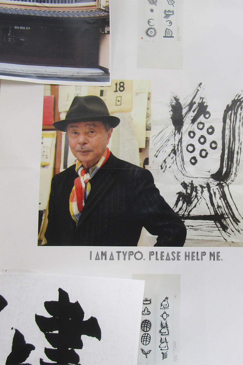
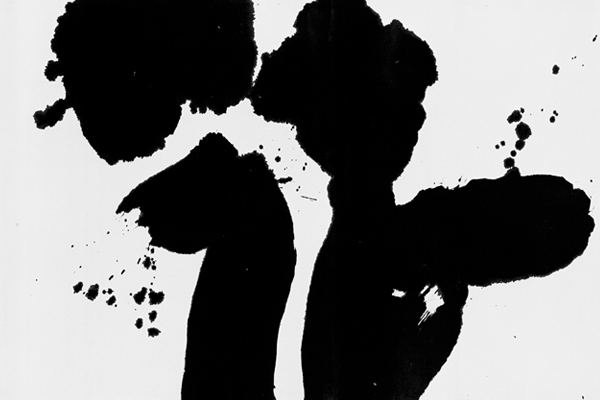
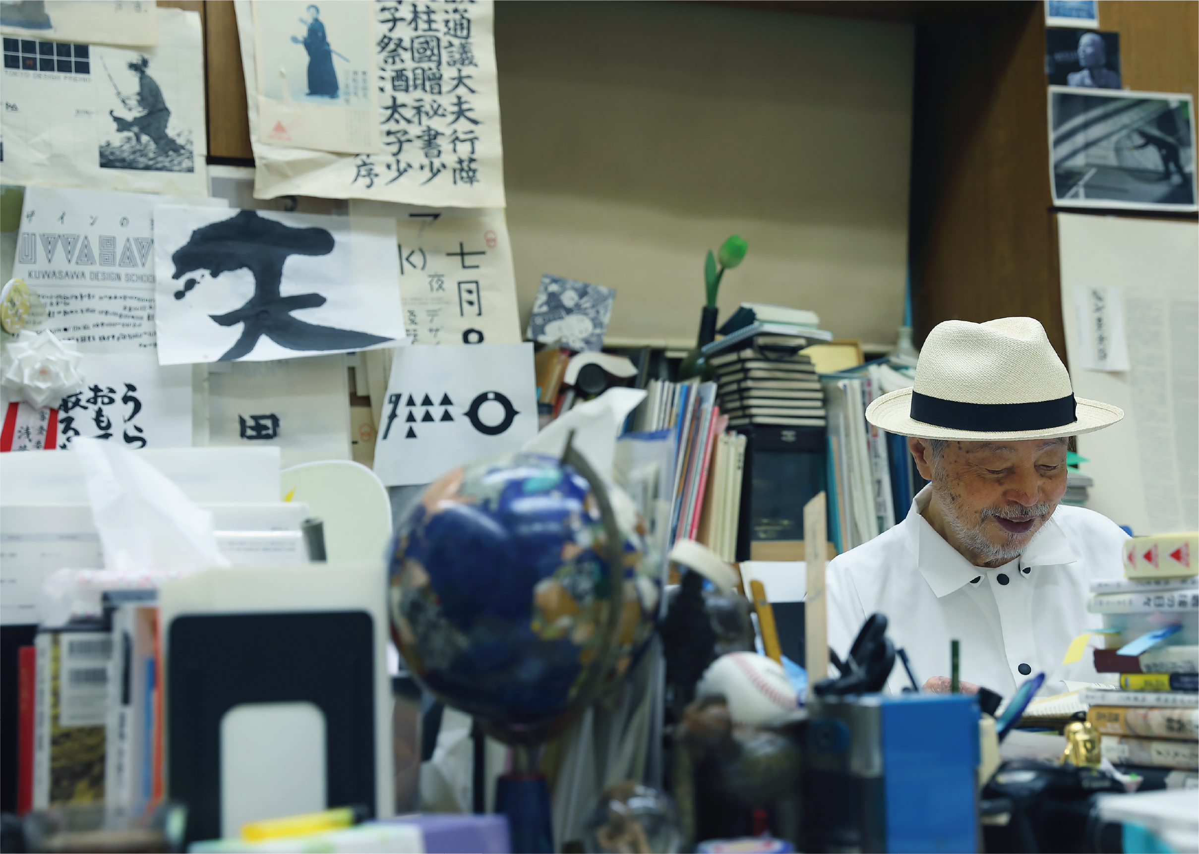
掠れや滲み、途切れといった偶然さえも美となる「自由な字=じゆうな じ」づくりの名手である浅葉克己さんを訪ねた。
トンパ文字、書、タイポグラフィを巡る文字の冒険家の軌跡を辿る今号の特集ページ。
この号を読んでタイポグラフィの楽しさを知ってもらえると嬉しいです。
On Why Typography Is Meant to Be Free.
In a world filled with perfectly symmetrical,
digitally generated fonts, their convenience is often accompanied by a certain inorganic, suffocating uniformity.
Originally, writing revealed the unique character of the person who created it, imbuing it with a human warmth.
In printing,
characters were designed and enveloped in a unique charm,
where even accidents like blurring, bleeding,
or broken lines became beautiful.
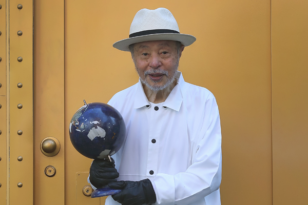
We visited Katsumi Asaba,
a master of creating “Typography Unbound”.
The feature story in this issue traces the journey of this “adventurer of characters,”
exploring his work in Dongba script, calligraphy, and typography.
We hope that by reading this issue,
you’ll discover the joy of typography.
かつて、文字は本やポスターなどの紙の上で重要な役割を果たし、
デザイナーは工夫を重ね、ときには写植文字に手を入れながら表現した。
デジタル化が進んだ現在、文字は機能性が優先されるようになったが、それでも紙に印刷されたタイポグラフィが人の心に響く力を失ったわけではない。
そんなタイポグラフィの魅力を探るために、「地球文字探検家」を名乗り、世界中で文字を探し続けてきた浅葉克己さんにインタビュー。
文字を自由にデザインする、その楽しさに触れてみた。
Once, letters held court upon paper—books and posters alike—
and designers, through craft and effort, even refined phototype characters by hand.
In today’s digital age, functionality reigns supreme,
but typography in print has not lost its ability to move us.
To explore that allure, I spoke with Katsumi Asaba, a self-styled ‘global script explorer’
who has sought letterforms the world over.
I experienced the joy of designing letters with true freedom.
印刷などで使われる文字をデザインするタイポグラフィは、書籍やポスター、雑誌といった紙媒体で中心的な役割を担っていた。言葉にあるメッセージをより鮮明に、美しく、見る人に伝えるためにつくられる文字。それをデザイン(タイポグラフィ)することはグラフィックデザイナーの腕の見せ所だった。
良質なタイポグラフィのために、デザイナーは筆画(線や点)や字形を吟味し、ときには手を入れ、ミリ単位での文字間の調整に神経を削り、紙の質感やインキの滲みにまでこだわって文字を創作した。
ところが今では、インターネットやデジタルメディアが主流となり、文字の役割も大きく変化した。無数のデバイスやスクリーンで表示されることを前提に、文字は “美しさ” ではなく “流動する情報” を支えるインフラとなり、可読性・データとして容量の軽量化・機種による再現性への対応といった機能性が重視されるようになった。Webフォントの普及により、デザイナーの選択肢が広がり、個性ある書体を戦略的に用いることが可能にはなっているが、印刷されたタイポグラフィにあった味わいや質感といった情感は伝わりにくい。
歴史的に、文字は常にメディアの変遷とともに進化してきた。活字が鉛からデジタルデータになったように、今のデバイスフォントやWebフォントも過渡期にすぎないのかもしれない。そうして時代は変化していこうとも、かつて紙の上でさまざまな表情を見せていたタイポグラフィは今でも、私たちの心を揺り動かす存在であり続けている。
字が自由だった頃があった。グラフィックデザイナーたちが競って、オリジナルの文字を創っていた。そんな時代を牽引していたのがアートディレクターの浅葉克己。「地球文字探検家」を自称し、世界各地で文字を探究することで得た知見を日本のタイポグラフィへとフィードバックする。そんな浅葉克己の旅を辿ってみれば、自由な字の素晴らしさと可能性が見えてきた。
Typography, the design of characters for print media like books and posters, was once a central role for graphic designers. They meticulously crafted type, paying attention to every detail—from strokes and spacing to the texture of the paper and ink bleed—to convey a message with clarity and beauty.
Now, with the rise of the internet and digital media, the role of typography has shifted. Instead of focusing on “beauty,” characters have become infrastructure for “fluid information,” prioritizing functionality like readability, light data size, and cross-platform compatibility.
While web fonts offer more options, the emotional weight and texture of printed typography are often lost.
Historically, type has always evolved with media, and today’s digital fonts may simply be a transitional phase. Yet, the expressive typography that once graced the pages of print continues to move us.
Katsumi Asaba, a self-proclaimed “adventurer of characters,” was a leading art director in an era where designers competed to create original fonts. By exploring his journey, we can see the wonderful possibilities and freedom of type.

閲覧中の特集はこちら